Ok, I know this is a little different but hear me out. A while back it was pointed out to me that I had maybe overdone it a bit in my mission to de-bachelorize (totally a word, I’m sure of it). In his defense, my dear Hubby has never complained a bit.
So, I thought I would try to inject a bit of geek-chic, if you will, back into our home. To start with, Hubby is a huge Lord of the Rings fan and that’s where I started. There’s got to be a way to be design friendly about it, right?
The idea started out as a joke and then I thought it would be something he might get a kick out of. As a friend pointed out you could do this so many different ways (think the Cantina Scene from Star Wars). The sign is something I put together from my Hubby’s favorite bits in the movie. And, the original layout was to have another line but when I was adding in the wording I felt like it would be too crowded. So, this is what I ended up with and I’m really happy with it.

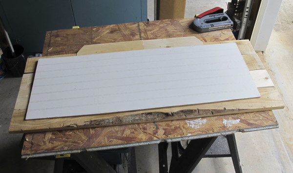
I started by measuring where the sign would go and designing a layout to fit. Then I cut and sanded pieces of both new wood and pallet wood to size, fitting them together like a puzzle. The top pieces were cut at an angle using a miter saw. (see similar here or use a miter box like this) Here I used a piece of left over bead-board as a backer to attach them and hold them together.


When I was happy with the shape and everything was nicely sanded I used a mixture of 2 parts black paint, 1 part water and 1 part glaze to “stain” the wood a darker grey/black. It gave the wood a look like it had been aged “wet” but out of the elements.

I let this dry overnight and then started the crackle process. Instead of using a regular crackle medium I used regular school glue and a coarse brush to brush it on.

You can see that I applied it more thickly in some areas to make it “crack” differently. Then, I let the glue dry for about 5 minutes. While it was still tacky I brushed on white acrylic paint really thickly.


Once it had crackled and dried thoroughly I decided the background was too dark. So I thinned out the white with some glaze and brushed over the whole piece. Much better!

I let this dry overnight before adding in the lettering. The glaze made it tough to add the letters using more popular Pinterest methods so I used my handy-dandy Artograph Tracer Projector. I don’t use it very often but love this thing! They make much snazzier versions but this little fella works just fine for me. I traced the letters with a pencil and then painted in the letters using the black “stain” that I had left over from before.

If you try your hand at your own “geek chic”, design friendly, creation I’d love to see!

* This post contains affiliate links but all opinions are my own.
Linking up at Met Monday, The Scoop, Remodelaholic , and Wow Us Wednesday

[…] Rustic Geek-Chic Sign {White Tulip Designs} […]